
The year is 1854. London is in the middle of yet another cholera outbreak. There had been one in 1832, and another five years earlier in 1849 that killed 14,137 Londoners. Mostly women and children.[1] Cholera is a nasty thing. People suffering from cholera experience watery diarrhea that can lead to severe dehydration. This results in sunken in eyes, cold skin, and turning blue. In addition, it may also cause vomiting and muscle cramps and as seen above, death. The germ theory had not been established yet – Louis Pasteur would not propose it until seven years later in 1861 – and instead people held to the miasma theory, which held that somehow “bad air” was to blame. It certainly was not the slaughter houses and grease boiling dens lining the streets, or the overrunning cesspools underneath the cellars. Doing what governments do, the London authorities wisely dealt with the cesspool problem by pumping the sewage into the Thames. Problem solved. Miasma theory is, incidentally, the same theory that proposed one could become obese by smelling too much food. Thankfully, none of this sounded quite right to an epidemiologist named John Snow. Dr. Snow decided to do something quite radical for the time. Rather than fearing sinister “bad air”, Dr. Snow wanted to approach the problem with data. He decided that he needed to collect data, and then analyze that data. When Dr. Snow had gathered the information, he did something else that was revolutionary. He put his data onto a map, creating a visual chart of his data. Dr. Snow was an early data analyst. Was Dr. Snow, the budding data scientist successful in his efforts? We’ll come back to Dr. Snow and the dear old London at the end of this paper.
Data and statistics. The very terms conjure up unpleasant images for many. Perhaps not as unpleasant as a description of cholera, but unpleasant nonetheless. Data conjures up views of rows upon rows and columns upon columns of figures and calculations and formulas in Excel. Reams of paper printed out and being poured over by hapless analysts. Dreadful, overused clichés like the term “Big Data.” To use an example from pop culture, in what had to be a symbolic choice by Gene Roddenberry, “Data” is the name given to the emotionless, humorless (but loveable!) android of Star Trek – The Next Generation fame. The term “statistics” fares no better. As Edward Tufte, author of The Visual Display of Quantitative Information, a touchstone book in the world of data analysis, says, “For many people the first word that comes to mind when they think about statistical charts is ‘lie.’”[2] Mark Twain famously said, “There are three kinds of lies: lies, damned lies, and statistics.” Here is a confession of sorts. I love data and statistics. I work with data both for a living and as a hobby. And I must ask, does it have to be this way? Does the mention of the word data need to elicit eye rolls and nightmarish visions of 3-D bar charts in endless PowerPoint decks? I answer with a resounding “No!” Far from being dry, dehumanizing, and mechanical, effective data analysis is actually a form of storytelling. When data is used properly, it takes the “reader” on an adventure. It tells a story. The job of a data analyst, or data scientist, is not merely to be a number cruncher, grinding through statistics. Rather, their job is a high calling. It is an artistic calling. It is to be a storyteller.
This might seem to some a bold statement to make, particularly at a conference dedicated to the idea of wonder and academic inquiry into some of the most brilliant stories ever written. If I wanted to prove that data analysis is a form of storytelling, I needed to start with the basic questions; what is a story, and what do I mean by data analysis? Like any good fan of Tolkien, I turned first to the Oxford English Dictionary. Then, seeing it was twenty-two volumes and that the definition of “story” spanned multiple pages, I turned to the two volume Shorter Oxford English Dictionary. There I read that a story is “a recital or account of events that have or are alleged to have happened; a series of events that are or might be narrated.”[3] That’s certainly workable. Turning to data analysis, there is currently no consensus definition of what exactly it means, but many data scientists put forth a definition with three parts; data exploration, statistical analysis, and presentation, or visualization. Data exploration and statistical analysis are both technical disciplines that take quite a lot of time to master and a deep dive into those areas is beyond the scope of this paper. It is the third element, visualization, on which I would like to focus. If the data exploration and statistical analysis are the science of data analysis, visualization is the art. It is here that the definitions of storytelling and data analysis begin to harmonize. The purpose of exploring and analyzing data is to find precisely the things mentioned in the Shorter OED definition of story. The analyst is trying to create an account of events that have happened. She is frequently trying to find if any variable in the data changes over time. She is trying to find patterns in the data that express similarity to other situations. In this way, data analysis is an investigative journey to uncover the bones of a story. Only after finding the right information can the successful data analyst move on the next stage. As Tufte says in his excellent book on visualization, “If the statistics are boring, then you’ve got the wrong numbers. Finding the right numbers requires as much specialized skill – statistical skill – and hard work as creating a beautiful design or covering a complex news story.”[4]
Once the bones are uncovered, the mechanics of data visualization are similar to those of storytelling. In his book The Storytelling Animal: How Stories Make Us Human, Professor and researcher Jonathan Gottschall talks about the fundamental nature of telling stories in the following way.
“These are undeniably nervous times for people who make a living through story. The publishing, film, and television businesses are going through a period of painful change. But the essence of story is not changing. The technology of storytelling has evolved from oral tales, to clay tablets, to hand lettered manuscripts, to printed books, to movies, televisions, Kindles, and iPhones. This wreaks havoc on business models, but it doesn’t fundamentally change story. Fiction is as it was and ever will be: Character + Predicament + Attempted Extrication” [5]
N.T. Wright has a more extensive and nuanced view of how story works. Owing much to the work of Vladimir Propp and A.J. Griemas, Wright’s rich understanding of the mechanics of storytelling and the importance of meta-narrative forms the foundation of much of his scholarly work. Indeed, Wright views story telling as literally life changing. He states that stories “actually change how people think, feel and behave, and hence change the way the world actually is…”[6] According to the method he expounds, all stories can be divided into three moments. The first moment is the initial sequence, in which a problem is set up or created. Thirteen dwarves and Gandalf the Grey show up for an unexpected party. An owl brings a message that Harry is a wizard. The Chandrian show up and murder Kvothe’s parents for singing the wrong sort of songs. The second moment is the topical sequence, where the characters try to solve the problem. The fellowship is sent out to destroy the One Ring in the fires of Mt. Doom. The Pevinsie children must rescue Edmund and defeat the White Witch. Túrin goes out and tries to prove that he’s the master of fate. Finally the third moment is the final sequence, where the task is finally (usually) accomplished. The Dragonriders save Pern from the Threads. Jyn Erso and Cassian Andor are able to transmit the plans for the Death Star to a frighteningly rendered CGI version of Princess Leia. Little Red Riding hood and her Grandmother are saved from the wolf by the woodsman; unless you read the real version. Mini versions of these three sequences can play out over and over during the topical sequence. I like to think of these as the side quests.
These frameworks for what a story is provide valuable insight for the analyst working on data visualization. It provides a series of questions that can be asked of the data to provide a systematic way of finding the bones. First, who are the characters? Who is impacted by or represented by the data? For a story to be meaningful and stay with the viewer or reader, the characters have to be presented in a way that helps the viewer or reader to understand and identify with them. Dr. Snow was not simply trying “stop cholera.” He was finding out what was killing hundreds of wives, sons, and daughters. He understood that his data needed to be about people. One’s data stories will be much more impactful if they are about real people.
Second, what is the predicament? What is a clear statement about the problem that is being addressed? It is too common in the field of data analysis to simply look at all the data and hope for something to “stand out.” This method of data inquiry is rarely successful. Instead, the data analyst needs to understand the problems that the data is addressing. This takes skill and patience. It may even take talking to actual people about the data. Data analysis should not take place completely isolated in a room with a laptop. Interviewing people, finding out what their hunches are, asking for things they have noticed is necessary. This is also helpful to the data analyst because it gives them an opportunity to discover what is important to the eventual audience of their work.
Third, what is the sequence of events? What have the characters in your story done to try and solve the problem? Or, what has been done to try and help the characters in the story? What attempts were made at extrication? Unless one happens to be James Joyce and happens to be writing Finnegan’s Wake, a story must have a sequence. As C.S. Lewis says, “to be stories at all they must be series of events.”[7] Understanding the actions that led to the creation of the data provides valuable insights and can provide clues to the analyst about what they are searching for.
After this groundwork has been laid, the data analyst must come to the final sequence. This is the “so what” of the whole process. The story they are telling must have a point, a discovery, or a recommendation. This may not be immediately apparent. It takes time. Much like writing a manuscript for a novel, the analyst may not always know the destination. I’m reminded of one of my favorite Tolkien quotes where he is writing to W. H. Auden about writing Lord of the Rings and the things he discovered in Middle-earth.
I met a lot of things along the way that astonished me. Tom Bombadil I knew already; but I had never been to Bree. Strider sitting in the corner at the inn was a shock, and I had no more idea who he was than had Frodo. The Mines of Moria had been a mere name; and of Lothlórien no word had reached my mortal ears till I came there. Far away I knew there were the Horse-lords on the confines of an ancient Kingdom of Men, but Fangorn Forest was an unforeseen adventure. I had never heard of the House of Eorl nor of the Stewards of Gondor. Most disquieting of all, Saruman had never been revealed to me, and I was as mystified as Frodo at Gandalf’s failure to appear on September 22.[8]
While no story crafted by a data scientist may rise to the level of Tolkien’s Middle-earth, the process of discovering new insights is similar. One may not know exactly where the data is taking them, but the journey is worth the taking.
Does this mean all data visualization is good storytelling? By no means. According to a data analyst at Mental Floss, approximately 134,021,533 known books have been published.[9] While I have not read all of them, I believe that my sample size indicates a high probability that this number includes a fair number of books with less than entirely remarkable storytelling. I can personally attest to the fact that much data analysis, including much of the content I have generated, is not good storytelling. However, it is my belief that this can change by giving data analysts a better understanding of the fact that they are, in fact, storytellers. Making the data personable and bringing it out of the abstract is important. Creating a narrative structure is mandatory. Taking the viewer on a journey to a destination is crucial. Improving the quality of storytelling in data analysis is an uphill journey but there are encouraging signs that the art is improving. One such example is the software Tableau. Their very name means a dramatic picture. The software uses the language and naming inside of the tool to remind the user that they are telling a story. Gone are the words “charts”, “graphs”, and “tables.” They have been replaced with the term “visualizations”. The dashboard contains something called a canvas. The visualizations that the user comes up with are put into a “story” and they are encouraged to create captions to explain the story. They have built an online community where users share their stories with each other and try to improve their own storytelling ability. These are small steps, but they show an important shift in the world of data analysis. People are recognizing the importance of being a storyteller. As storyteller extraordinaire Seth Godin states, “Before marketing, before shopping carts and long before infomercials, people started telling themselves stories. We noticed things. We noticed that the sun rose every morning and we invented a story about Helios and his chariot. People got sick and we made up stories about humors and bloodletting and we sent them to the barber to get well. Stories make it easier to understand the world. Stories are the only way we know how to spread an idea.”[10] And isn’t discovering an idea and sharing it the ultimate purpose of data analysis? If so, invoking the wonder of storytelling is the only way to do it.
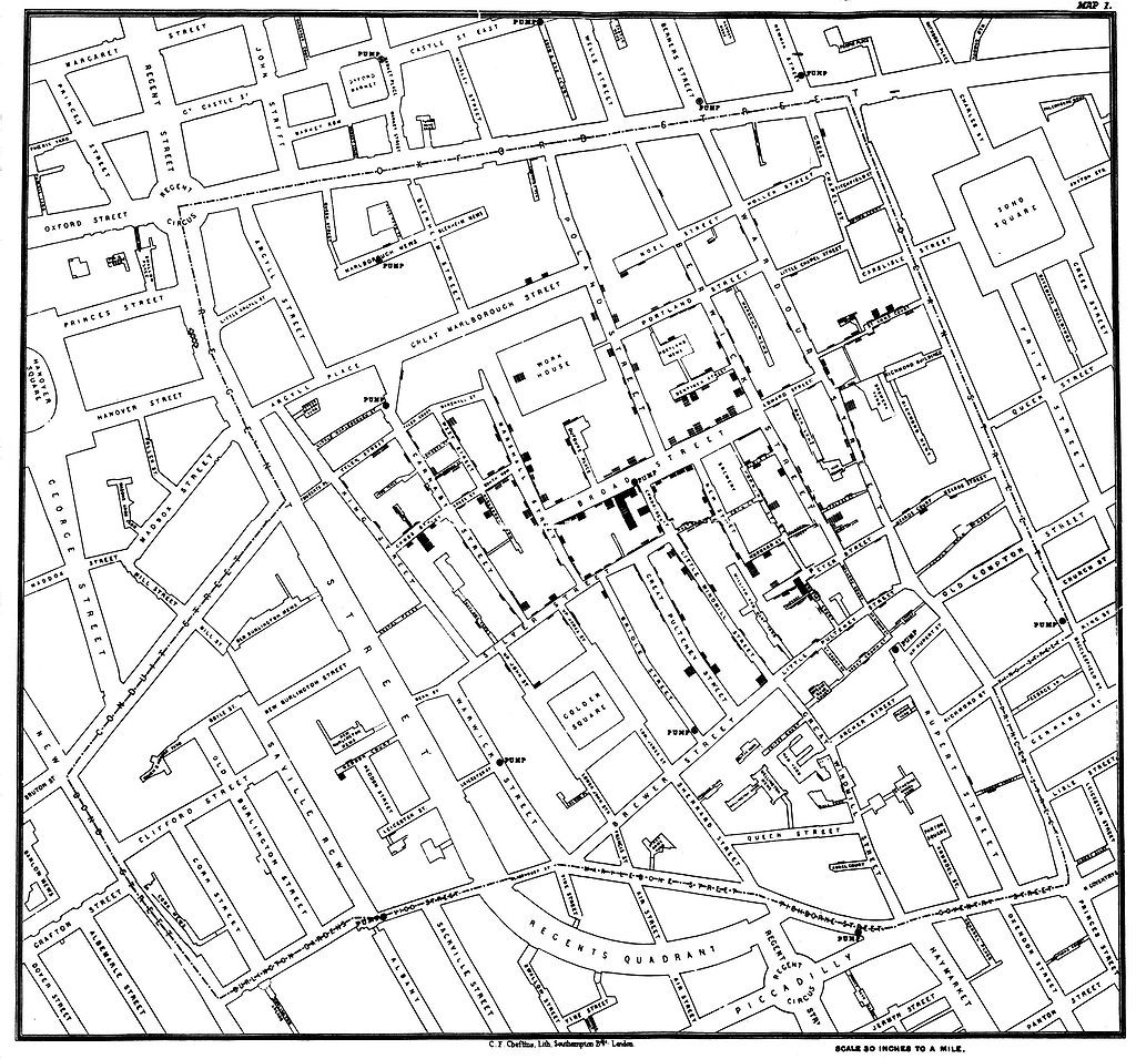
Back to Dr. Snow. We’re in 1854, and London is facing another outbreak of cholera. The last large outbreak took the lives of nearly 15,000 people. Dr. Snow has decided to research the problem and to interview the patients and doctors to try and find data. Plotting the deaths from cholera on the map started to show an amazing picture. Almost every death was within walking distance of a particular water pump at the intersection of Cambridge and Broadstreet. With this information, he was able to convince the leaders of St. James Parish, using his data analysis as a form of storytelling, to disable the well pump. By the end of this outbreak, only 616 people had died. Not a perfect ending to the story, but a much more satisfactory one than another pandemic killing 15,000 residents. If one travels to that location today, one can still find a replica of that pump and a red granite paver marking the location of the original pump. It is, in my mind, a small monument to the power of data analysis when combined with effective storytelling.
[1] “Broad Street Cholera Pump.” Atlas Obscura. Accessed May 01, 2017. http://www.atlasobscura.com/places/broad-street-cholera-pump.
[2] Tufte, Edward R. The Visual Display of Quantitative Information. Cheshire, CT: Graphics Pr., 1986. [53]
[3] Shorter Oxford English Dictionary. Oxford: Oxford University Press, 2007.
[4] Tufte, Edward R. The Visual Display of Quantitative Information. Cheshire, CT: Graphics Pr., 1986. [80]
[5] Gottschall, Jonathan. The Storytelling Animal: How Stories Make Us Human. Boston: Mariner Books Houghton Mifflin Harcourt, 2013.
[6] Wright, N.T. New Testament and the People of God: Christian Origins and the Question of God. Minneapolis, MN: Augsburg Fortress., 1992.
[7] Lewis, C. S., and Walter Hooper. Of Other Worlds: Essays and Stories. San Francisco: HarperOne, 2017. [18]
[8] Tolkien, J. R. R., Humphrey Carpenter, and Christopher Tolkien. The letters of J.R.R. Tolkien: a selection. Boston: Houghton Mifflin Co, 2000. [216-217]
[9] “How Many Books Have Ever Been Published?” Mental Floss. September 09, 2016. Accessed May 1, 2017. http://mentalfloss.com/article/85305/how-many-books-have-ever-been-published.
[10] Godin, Seth. All Marketers are Liars: the power of telling authentic stories in a low-trust world. New York: Portfolio, 2005. [2]